The Beauty of Understatement

Category
Daylight
Daylight & Architecture
Discussions and viewpoints
Author
Tristan Rudebeck Labianca
Chris Schroeer-Heiermann
Photography
Chris Schroeer-Heiermann
Date
February 2024
Share
Copy
Architect Chris Schroeer-Heiermann praises the advantages of working with an existing building, pointing out that one has to add daylight where it is missing. The thin volume of the ‘Dreiparteienhaus’ in Cologne, Germany, created many opportunities to bring in the light to the darkest corners of the building.
In the first step, he decided to move the circulation, which had been along the marketplace façade, to create living spaces on the window side. This move dictated a lot of the follow up design decisions.
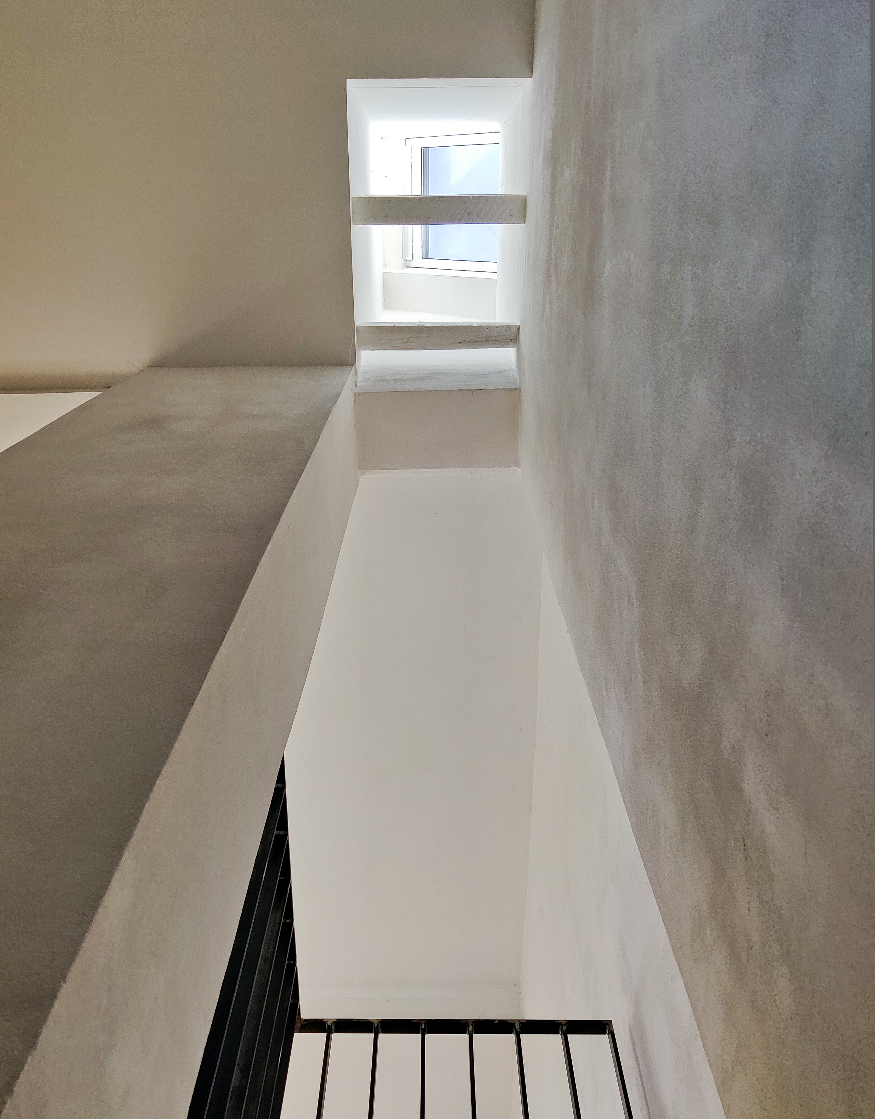
The house, with three intertwined units, has no corridors: the stairs, connecting the levels on which the apartments are distributed, are circulation space and light sources alike.
“I LIKE TO THINK ABOUT A HOUSE AS A BIG SOLAR CLOCK, WHERE YOU
FEEL THE MOVEMENT OF LIGHT AND THE PASSING OF TIME.”

D/A: The remodelling reveals that you have intensively studied the incidence of light and the lighting inside. How do you generally approach daylight planning in your projects?
CSH:I actually always start with the light when beginning a new project, analysing the lighting conditions and thinking about what possibilities would optimise the use of light. This then determines the spatial composition of the interior. In the process, I work a lot with perspective hand sketches of the interior and exterior – and of course with models. The advantage of this is that with a model you can relatively easily visualise the incidence of light at any hour any any day of the year.


“THE FIRST THING I ANALYSE ON A NEW SITE IS WHERE THE SUN RISES AND WHERE IT SETS. EXPERIENCING THE WEATHER, SEEING WHAT THE DAY WILL BE LIKE, OR WITNESSING HOW IT ENDS ARE LITTLE BIG MOMENTS THAT I WOULD LIKE PEOPLE TO DISCOVER.”
D/A: When working with refurbishing an old building, it introduces many restrictions when interfering with previous traditions of architecture related to both proportion of the interior and also the construction. Could you describe the principles you have worked with in order for daylight to enter the building?
CSH: It was a very unique shaped house, not necessarily the shape, but the proportions. The rooms were thin, long and very dark. The circulation was just one room after the other, with one door leading into the next and with all entrance doors on the side of the building where the row of windows was placed. So basically, all the living spaces were placed against a firewall and there was only one window per room. This meant that when someone entered the room, you would only see their silhouette, as the light originated from behind them. Creating uncomfortable, uninspiring and bland forms of living spaces.
Since the rooms only had windows facing northeast and the firewall facing southwest, then the only real or logical solution was to open up the roof in several places in order to bring light down to different areas of the building during different times of the day. And that of course, helped us define how the apartments should be divided up within the core of the building.
A very useful handbook of tips, that I am a big fan of and have propagated freely from, is A Pattern Language by Christopher Alexander. It is very readable and easily understandable, but all very true and all based on the human sensation within architecture or the built space. One of the tips is explicit – that light should come from two sides of every room.
During my education in Oregon, we basically had our noses rubbed in this book and it really makes the rooms or a building more livable when light comes from various sides, especially during different times of the day. And I kind of feel it, when spending a lot of time inside buildings with great daylighting. It is like living with a natural clock where you can see and feel the different times of the day. It is wonderful to wake up in the morning and have a coffee where there is daylight and sun, while also wonderful in the evening to be able to see the sun setting. That is what I am trying to form spaces around, feeling the light or being aware of the light. By being aware of the time of day, it lets me be connected to nature outside. It all has to do with light.


D/A: Were you inspired by other refurbished projects or what inspires you when working with daylight?
CSH: Studying abroad in Denmark and learning the northern traditions of using daylight was certainly a key part of my education. We went on excursions into Sweden and Finland and saw wonderful buildings created by Alvar Aalto, Erik Gunnar Asplund, Jørn Utzon and all the masters of this time. It is a much different relationship with light. It is about appreciating light on certain surfaces and the different materials that are used with very modest intentions. There is the solemnity of working with light, as also seen in the Nordic Pavilion by Sverre Fehn.
D/A: Were there any specific rooms where you wanted daylight to help create attention?
CSH: We wanted the rooms closest to the facade to have plenty of daylight from the facade windows and that made us change the circulation area to be placed up against the back firewall. In order to have daylight coming from two sides, it made sense to let the walls surrounding the circulation area reflect daylight down from above, all the way to the ground floor. This is especially eye–catching in the early morning hours within the kitchen, where the light comes through the facade windows and from the back wall. Not only is the stairwell sufficiently illuminated by the light coming from above, but it also spreads the light into the living room, while at the same time washing the brick wall quite nicely. The stairwell really gave us a lot of opportunities for placing daylight into the core of the building. When an edge of a skylight continues down along at least one wall, you are able to maximise the reflection created on the surface of the wall instead of puncturing the roof with a lot of skylights. This only adds difficulties when it comes to the structural elements of the building.
"DURING EVERY CONSTRUCTION PROJECT, THERE ARE MOMENTS YOU'RE WAITING FOR IMPATIENTLY. CUTTING FLOORS TO REVEAL
NEW, VERTICAL SPACIAL CONNECTIONS IS ONE OF THEM."
D/A: Was there anything in particular challenging or did you encounter unexpected surprises during the process of opening the building up, figuratively, now that you mention the structure of the roof?
CSH: There were certain times where we discovered how daylight accentuated certain details in the building during a specific time of day and year which I very much liked – this wasn’t planned. An example would be that, I left an opening between a steel beam and a load bearing wall because light came through this specific opening very nicely. It also surprised me, the amount of light that is reflected off the walls, throughout a three storey building, from a relatively small hole in the roof. It still comes down to my preference and that is an indirect light, which means that one will not see the opening where the light comes from, but one will experience and appreciate the light that is coming inside the building. That is the approach I am trying to achieve in most of my projects.


D/A: With the building already standing and even across the street from where you live, you had the possibility to use a 1:1 model for testing. Did you take advantage of this opportunity to test certain ideas beforehand and see the effect on the daylight coming into the building?
CSH: It was certainly a luxury to have the construction site right in front of our door. Because we did a lot of the work ourselves, we could cut a hole in the ceiling or take a couple of tiles off the roof and take out the insulation and see what happened. That certainly cemented the decision to bring the light all the way down. If you’re in the position where you need to have a contractor present and counting the hours, then maybe you wouldn’t be quite so free with the time or with the experiments or you just had to do better work in a scale model beforehand. If the model is actually in 1:1 in front of you, then the effects of your testing is much easier to decide upon.


Constructed out of steel mesh – Chris Schroeer-Heiermann tested various sizes of the perforations to find the one letting maximum light through, while offering the necessary stability – the stairs are like sculptures in the restrained yet precise interior design. A close look reveals traces of the craftsmanship, like welding traces or imperfections of the surface, protected with linseed oil.


Chris Schroeer-Heiermann recalls the thrill and challenges of the refurbishment. At first, the Schroeer-Heiermanns imagined the project and construction to take two years. It took four years of experiments on-site, testing sources of natural light by puncturing ceilings and walls, and a lot of hands-on work on the site until the first tenants moved in.
Schroeer-Heiermann sees more value in a lively community than in higher revenues, so they chose to rent the ground floor to a union of women artists, organising different workshops each week.
To see more information about realized daylight projects please visit https://referenzen.velux.de/b2b-inspiration/
