Beneath
Surfaces are regarded as the epitome of surface beauty and fleeting impressions. Nevertheless, they are the basis of how we perceive the world: a journey to the surfaces of the earth and what lies beneath them.
“Swimsuits are modelled on sharkskin, dirt-repellent fabrics on lotus leaves and anti-microbial plastic-film wrapping on ostrich eggs.”

Surfaces of things constitute our image of the world. Their interaction with light provides us with more than three quarters of our sensory experience, but also with the energy that we live and feed on. In nature as in technology, surfaces act as communication interfaces, providing a means of exchanging matter and information. The metabolism of any living creature will inevitably involve its surface – be it through evaporation, the intake of sunlight energy or food, or heat exchange.
But it has been a long time since the surfaces of our world were determined solely by the laws of nature. In an alternating process of give and take, we learn from the surfaces of nature and shape them according to our wishes. Swimsuits are modelled on sharkskin, dirt-repellent fabrics on lotus leaves and anti-microbial plastic-film wrapping on ostrich eggs. At the same time, there is little of the earth’s surface that has not been transformed by human beings – some scientists envisage the oceans themselves being transformed into huge algae farms. Almost any surface can today be created artificially, even some that appear to have no immediate or future application. But it is our ability to interpret surfaces correctly that is, and will continue to be, decisive for the survival of our planet. So it is worthwhile taking a look beneath the surfaces of our world.
Changing views of the world
It took Galileo Galilei only a small apparatus to change the human perception of the world. In 1609, the Italian mathematician and astronomer turned one of his first self-built ‘perspective glasses’ – telescopes we would call them today – to the moon. In doing so, he observed that the earth’s companion was by no means the smooth, immaculate sphere it should have been according to the theories of Aristotle, which, despite their pagan origin, medieval Christian society still adhered to. In his scripture ‘On the Heavens’, the Greek philosopher had outlined a concept of the world that was to be valid for nearly two millennia: the earth, as the immovable centre of the universe, is surrounded by concentric strata: first, the four elements (earth, water, air and fire), and then the seven planetary spheres: the moon, Venus, Mercury, the sun, Mars, Jupiter and Saturn. From the moon onwards the universe consisted of an ethereal, indestructible quintessence, literally: the fifth element or substance, which is only capable of moving in perfect circles. As they consist of quintessence, all celestial bodies must, by nature, possess a perfect and immaculate spherical shape. (1)
In the light of this, Galileo’s findings were alarming news: he discovered found out that the moon’s surface was rugged and full of craters, 3,000 of which on the visible side of the moon alone have so far been identified and named. (This newly discovered texture has nothing to do with the apparent ‘face of the moon’ which can be seen with the naked eye. It is formed by four dark patches that were probably caused by large flows of basalt lava some four billion years ago). Galileo went on to more discoveries that made Aristotle’s’ theories obsolete; most notably, Jupiter’s moons and the sunspots. Not even the sun, which had been considered an immaterial source of divine light by medieval scholars, turned out to be no more than a “rock of fire”, as Anaxagoras had called it 2,000 years before.
Galileo’s findings not only precipitated the Catholic church into the deepest crisis it had ever known, but also marked the transition from the transcendental and mystical concept of light of the Middle Ages to the “scientific light” of the Modern Ages. Prosecuted by the Inquisition, Galilei had to abjure his heretical teachings in 1633. The fact that his writings remained on the Vatican’s index of forbidden books for two more centuries, and that Galileo was only officially rehabilitated by Pope John Paul II in 1992, is remarkable. It shows the importance that the Church attributed to the interpretation of light: if light no longer originated from a divine source but from profane matter, and if heaven was no longer a sphere strictly separated from the Earth, then where would God be? Besides their obvious fear of losing the monopoly of interpreting heaven and earth, the clergy’s reaction to Galileo’s findings also highlights a general problem of human perception: seeing is not sufficient, on its own, for recognition. Recognition happens when a visual image is compared to the understanding of things that is inherent in the human brain. This insight is not new; the philosophy of Plato, Aristotle’s teacher, was already based on this duality of phenomena (which are accessible to our senses) and ideas (which are only accessible to the human intellect). Plato claimed that universal ideas exist apart from – and preceded all – particular things. Our lack of universal ideas also inhibits our understanding of phenomena, as the reactions of many of Galileo’s contemporaries showed. They did not believe his observations, and even less the conclusions he drew from them, not only because they considered them potentially dangerous, but because they had no ‘idea’ that might have made the observations fit their understanding of the world. More recent evidence highlights the necessity of both ideas and phenomena for human perception: people who are blind from birth, and then gain eyesight through an operation after having lived in the dark for years, often have a hard time learning to make use of their new sense. They may see images, forms and colours, but cannot interpret their meaning until they have verified their perception by other senses, most notably, the sense of touch.
Terra incognita: The unknown planet
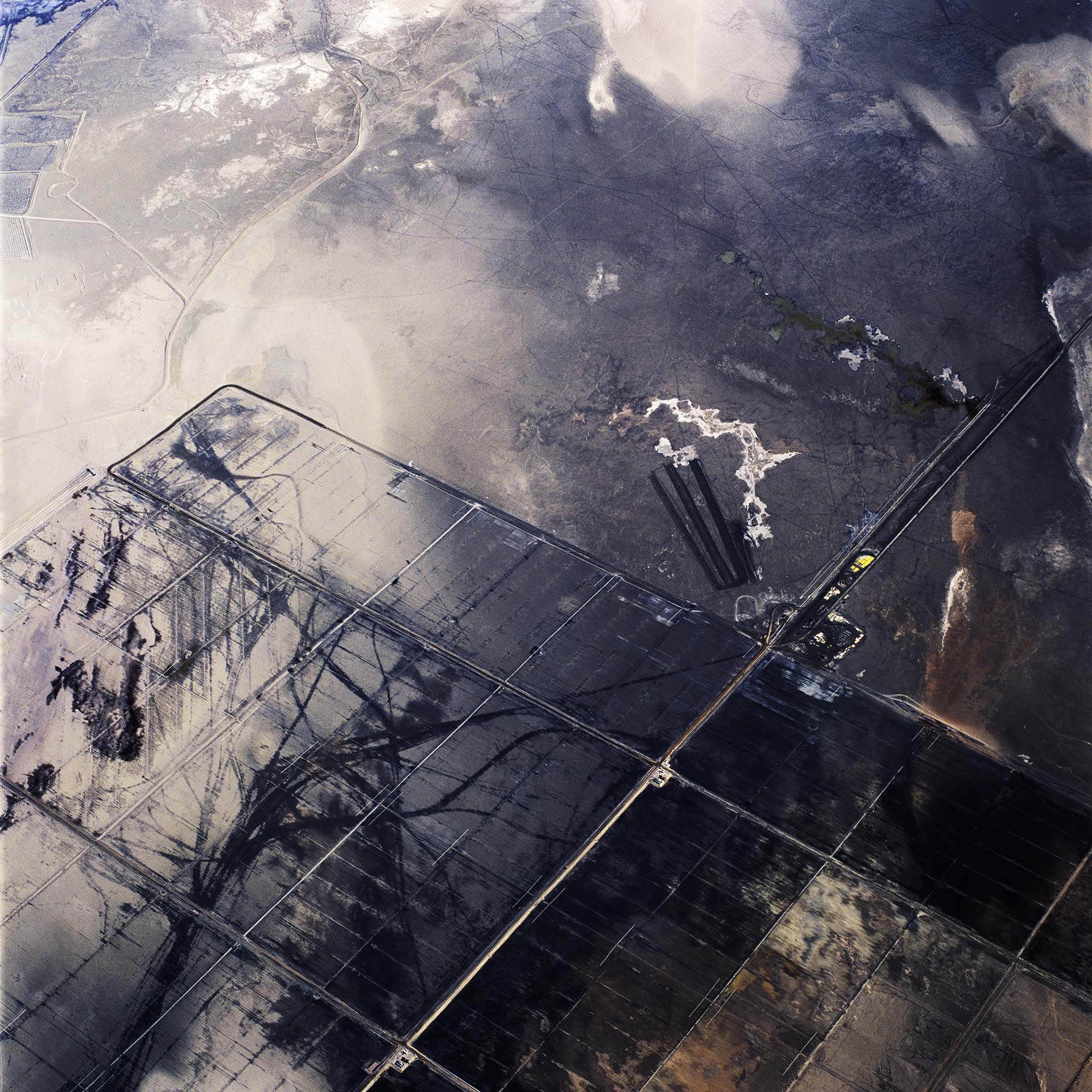
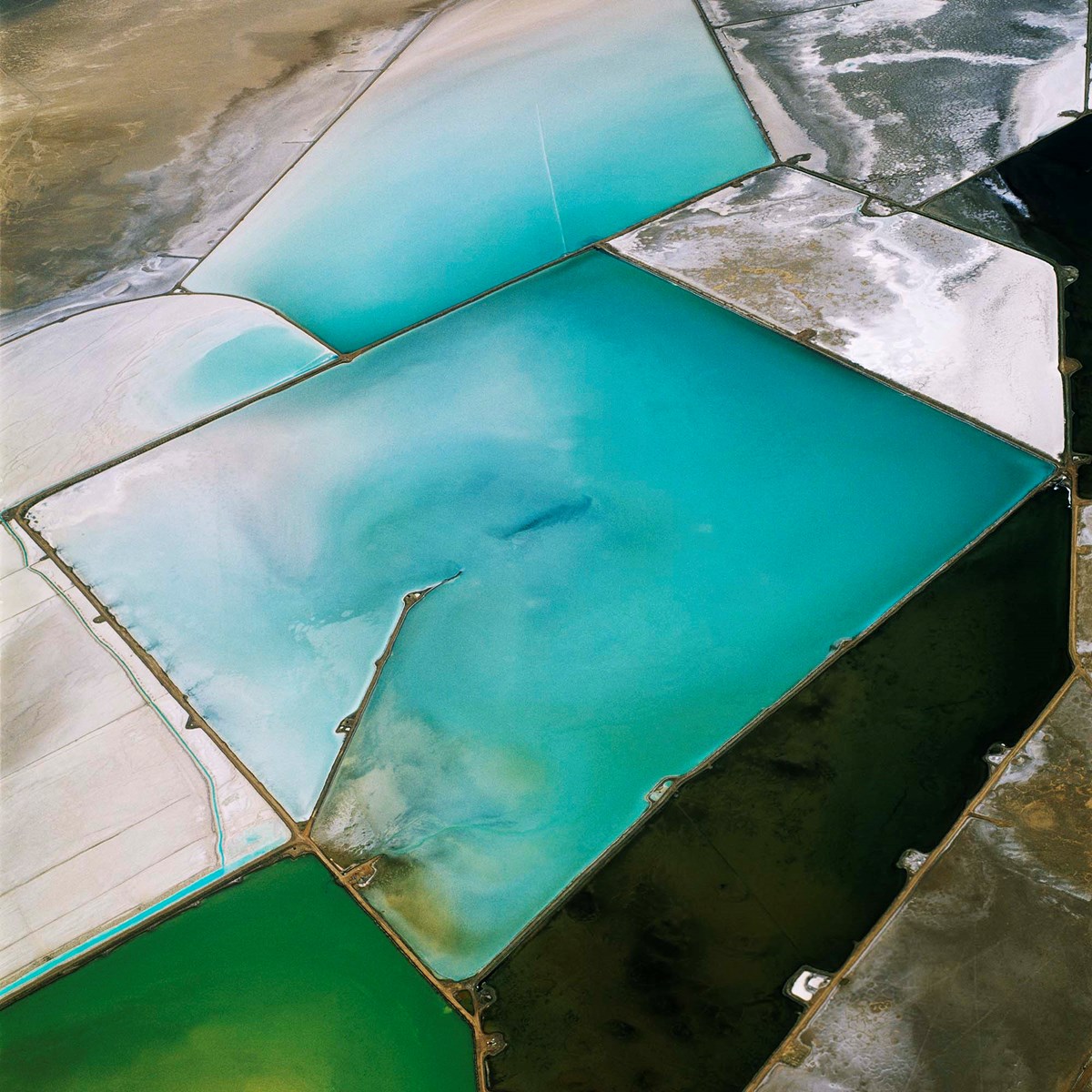
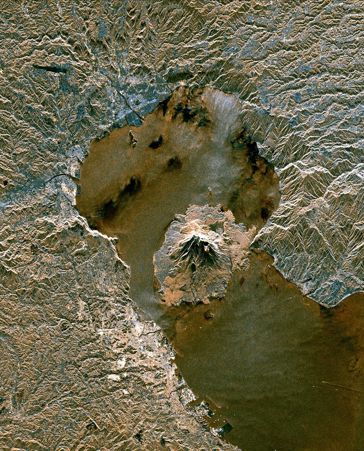
350 years after the discovery of the moon’s craters, man’s first trips into space marked a no less important turning point in history. For the first time, our planet was seen as a whole – not only by means of maps, globes and other models, but with the naked eye. The first images of Earth from space, as a unique ‘water planet’ with no visible geo-political boundaries, an interconnected seamless whole, gave people a sense of both the beauty and the vulnerability of their home. Since then, satellites have gathered a huge amount of data about the Earth – from vegetation to air pollution, and even the geologic formations beneath the planet’s surface. Websites like Google Earth have enabled us to travel to almost any given site on earth and visually explore it in detail. However, despite the rapidly increasing amount of scientific evidence, models, and images (which, to make things worse, we often perceive as threatening), we are finding it hard to form a coherent idea of the Earth’s surface and of the tremendous (and nowadays often man-made) forces that shape and change it. This becomes evident when we look at the works of such photographers as David Maisel. His ‘black maps’ of highly contaminated areas such as the Great Salt Lake in Utah, or Owens Lake in California, show us rugged, blistered textures in red, black and white that we find hard to interpret although they are, to a large extent, man-made. What is originally perceived as beautiful suddenly turns into something repellent when we become aware of what we are actually seeing. “The ground is bleeding. A red river cuts a path through a bleached valley, winding toward a lake that is no longer there. Seen from the air, the river and its dry terminus appear other-worldly,” wrote Diana Gaston about Maisel’s ‘Lake Project’ series in the magazine ‘Aperture’.(2) Maisel himself describes his work on the boundary between beauty and destruction as follows: “I became interested in making images that could be harsh or confrontational, while continuing to maintain their formal elegance and emotional resonance. I began to consider the photographs of Black Maps as elegies for lost landscapes [….]. Viewed from the air, vestiges of the lake appear as diverse as a river of blood, a microchip, a bisected vein, or a galaxy’s map. If death is the mother of beauty, as Wallace Stevens wrote, then The Lake Project images may serve as the lake’s autopsy. It is this contemporary version of the sublime that I find most compelling.” (3)
Whereas David Maisel documents the destruction of the Earth’s skin through beautiful images taken from afar, the British sculptor Andy Goldsworthy takes this same skin as a starting point for his – often small-scale and temporal – interventions that require us to look closely. By using materials from the site and carefully rearranging them, Goldsworthy’s work does not tell us about ecological cataclysms but about the silent, long-term and often subcutaneous changes that our cultivated landscape undergoes. According to Goldsworthy, “nature is intensely beautiful, and at the same time very unnerving, and at times deeply frightening. You feel it if you’ve ever stood in a wood that has been blown down after a strong wind, or through any incredible act of nature. You feel that as soon as you go out to the land, everywhere you go things are dead, decaying, fallen down, growing, alive. There’s this incredible vigour and energy and life. And it’s sometimes very difficult to deal with. I would hope that I don’t have a kind of romantic view of nature. I do feel the beauty of it, for sure. But it’s a beauty that’s underwritten by extreme feelings.” (4)
Small scale or large scale, both Maisel’s and Goldsworthy’s works have the power to effectuate lasting changes in the way that we perceive our environment, and probably in our attitude to it. Interestingly, neither of the two will say that they worked towards this effect on the viewer. “It’s not the intention of my work, but it does prime people towards environmental issues,”, Goldsworthy says. “I don’t know how it does that, or why, but it does. I’m happy for that to happen. But if that became the intention of the work, then the work would be weakened.” (5) Whereas Anne Wilkes Tucker writes about David Maisel: “While [he] abhors mankind’s mismanagement of the environment, his driving interests are aesthetic and philosophical. A serious student of the ideas as well as the art works of Robert Smithson, Maisel, like Smithson, questions the process of perception and knowledge.” (6)
Adolf Loos vs. Angelina Jolie: Purity and ornament in human civilisation
Most architects will know Adolf Loos’ contempt for ornament, which he describes as a sign of degeneration and immorality in his essay ‘Ornament and crime’ from 1908. One of the examples that Loos uses to illustrate his point is the heavy tattooing of native people, whom Loos considers not to have evolved to the same levels of morals and civilisation as modern man. Loos wrote: “The modern man who tattoos himself is a criminal or a degenerate,” and attributed similar values to heavily ornamented architecture. 99 years later, this attitude has obviously changed: “These days the tattoo sits firmly in (or on) the bosom of hip celebrity culture, sported by the likes of Angelina Jolie, Gwyneth Paltrow and supermodel Linda Evangelista,” wrote Pernilla Holmes in an exhibition review on tattoo art in 2001.(7) She continues, “What’s more, the tattoo remains a defiantly individualist brand in the face of global mass consumerism.” The same can be said of contemporary architecture, into which ornament has returned with vigour. This can be attributed, amongst others, to two phenomena. Firstly, there is the development of new manufacturing processes that allow the economic production of ornamented surfaces in ‘lot size one’ (an indispensable criterion if surfaces are to constitute a ‘defiantly individualist brand’). And secondly, the tendency towards ornament has to do with a new permeability of boundaries between architecture and other fields of art.
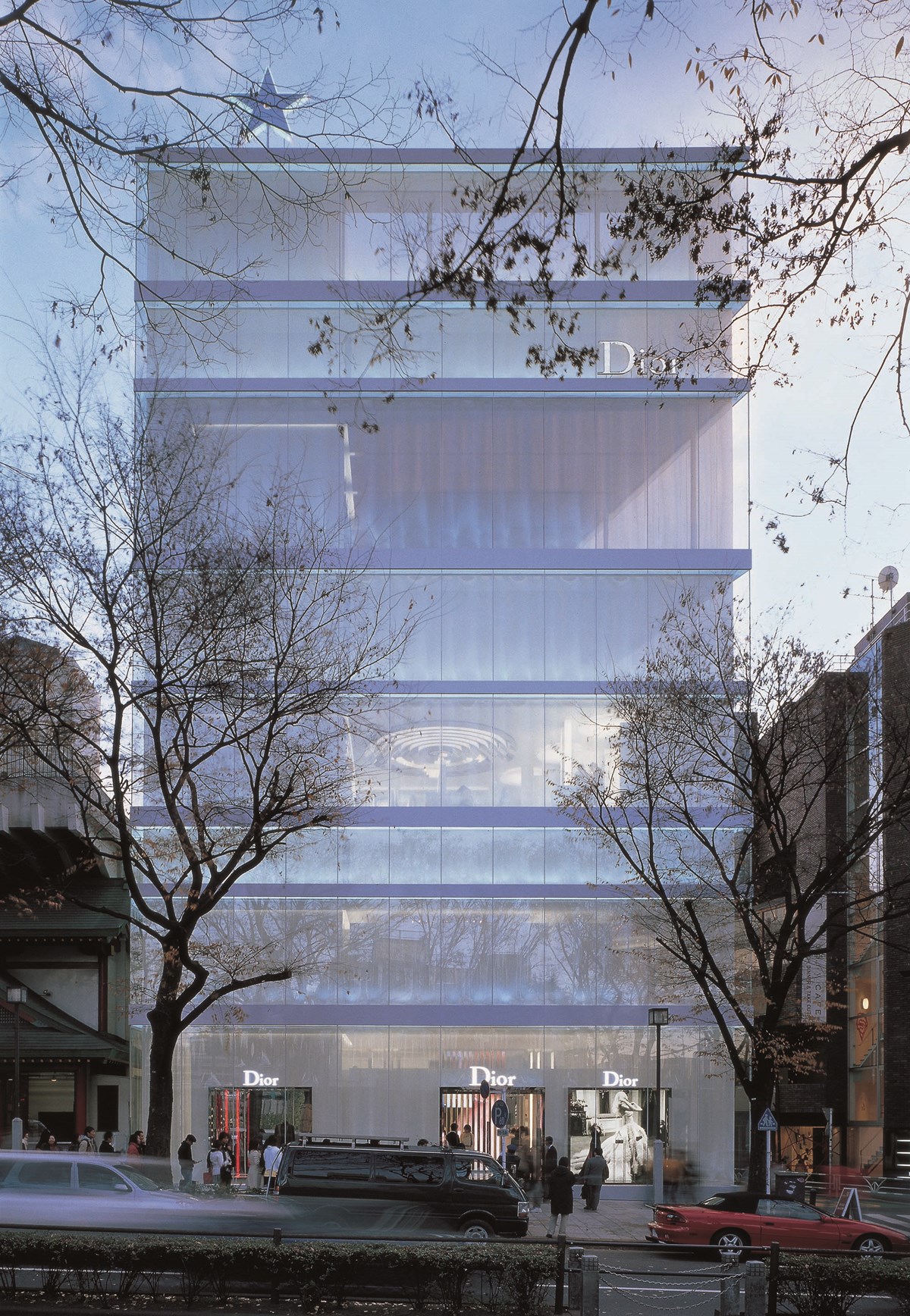
As a counter-strategy to ornament, Adolf Loos stressed the aesthetics of pure materials such as the warm grain of wood or natural stone and the lustre of metal that slowly and graciously covers itself with a layer of patina. A similar movement, which in many ways persisted to this day, started in the late ‘80s, when architects began to oppose the semantic extremes of both deconstructivism and Post-Modernism. Whereas these had almost entirely been obsessed by form, a new generation of architects – especially Swiss – started to be concerned about materials and their interaction with the site and its specific daylight situations. As Andreas Ruby pointed out, this new materialism, later termed ‘minimalist’, was firmly rooted in the Calvinist tradition of Switzerland. It invested labour and money into the ostentatious ‘non-show’ of ornament and detail rather than into the ostentatious display of wealth. Interestingly, a distinctly puristic, sensual variation of minimalism became the common ‘corporate architecture’ of most luxury brands from Armani to Prada from the mid-‘90s onwards. The companies’ desire for understatement and a museum-like atmosphere to present their goods are two reasons for this development. Another driving force was the fact that the fashion industry, which had by then had already evolved into a ‘‚beauty industry’, offering cosmetics and accessories, had become obsessed with the purity even of its architectural skins. In his essay ‘An Alabaster skin’ from 1993, Dutch architect Wiel Arets pondered over this intricate relationship between purity and reality, which he considered analogous to the duality of architectural ‘ideas‘ (i.e. designs) and built objects: “Architecture may be considered a desire for purity, a striving for perfection. The principal colour white marks a process in which the undecidable is respected: it is not a question of meaningful or meaningless. The whiteness of newly fallen snow in the morning light, the white of a perfect skin, the white of paper on which the design will be sketched – white is everywhere and may be considered the colour of origin and beginning […] Architecture is unblemished. Its entire logic risks something that is of only short duration. It appears only to disappear. […] It presents us briefly with freshness and untaintedness, only to lose those properties precisely by offering them to us. Architecture is therefore a between, a membrane, an alabaster skin, at once opaque and transparent, meaningful and meaningless, real and unreal. To become itself, architecture must lose its innocence; it must accept a violent transgression. It can only become part of the world by entering into marriage with its surroundings.”
Seeing and Re-seeing: A few reflections on projections
When the brothers Lumière showed one of their first-ever motion pictures in Paris in 1895 – a post train entering a station – the viewers reacted to this new experience as they would have done in real life: as the train approached the camera, they receded from the projection screen and, in some cases, even fled from the room. (In those days, movies were mostly shown in cafés or restaurants). Today, it would be hard, if not impossible, for any motion picture to produce similar reflexes in the audience. People have learnt to ‘cope with’ the medium of film, as they have done with virtually every medium they have been offered in the past.
Without doubt, however, moving images have altered visual perception in the 20th century. French philosopher Paul Virilio claims that even the notion of ‘transparency’ has changed (8) : from showing what is behind a surface to showing what the graphic designer or the film director and his cameramen want us to see. Just consider a TV image: everybody knows it consists of closely juxtaposed dots of red, green and blue light on a plane of glass but when we watch TV, we do not focus on this fact, nor on the fact that it is a pane of glass that we are looking at.
In his books ‘The Lost Dimension’ and ‘The Vision Machine’ from the early 1990s, Paul Virilio complains that mankind has lost its traditional immediacy of vision or, in other words: its perception of the material reality of things, to a mediated reality that follows a cinematic logic. According to Virilio, we are no longer ‘see-ers’, but ‘resee-ers’, who only perceive what the ‘eye’ of the camera or the animation artist has seen before them. In the case of modern ‘vision machines’, the flow of natural light has been replaced by a flow of electrons, and in computer graphics, even the direction of seeing is reversed: rather than on the rays of light emitted by sources of light, ‘ray-traced’ images are based on (virtual) ‘rays of sight’ that start from the eye and are reflected, diffracted or absorbed by different surfaces. More than two thousand years ago, Aristotle tried to explain human eyesight with a similar (but later discarded) model, according to which the eye emits minute rays of light that light up the surroundings and thus allow us to see.
In contemporary urban environments, our eye has little opportunity to contemplate things any more. Rather, it is constantly being ‘caught’ by images, colours, and rapid movements. One symptom of this ‘race for attention’ was the emergence of media facades and the proliferation of video screens in architectural space. Operating according to the principle of ‘big images, little words, great effects’ (9), these surfaces appeal to our innate orientation reflex, a mechanism for survival that immediately makes us turn our attention to any object in our field of sight that is large or otherwise conspicuous and moves. Video screens and media facades are, so far, the last step in a progressive debonding of buildings’ skins from their content that has taken place in the last few years. With their dynamic of changing lights and moving images, they have added a new level of complexity to our buildings, and provided architects with new means to create atmosphere and meaningful interaction with the user – but also to further enhance the ‘information overload’ that is omnipresent in our environment.
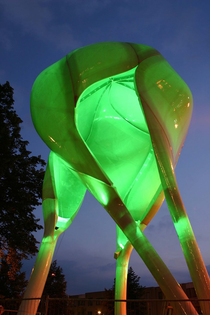
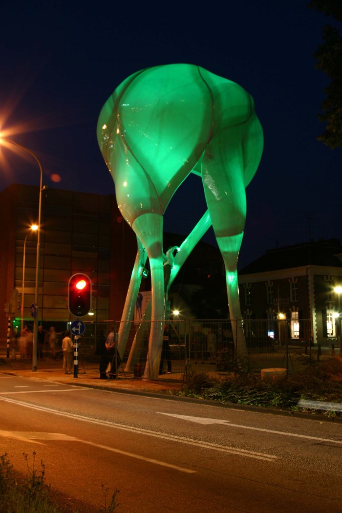
Lars Spuybroek’s illuminated ‘D-Tower’ in Doetinchem/Netherlands, whose colour changes according to the ‘moods’ and feelings of the town’s inhabitants (who, in turn, are assessed via a website), is an example of a playful dialogue between buildings and the public. Unlike traditional media facades, the tower and similar installation do not fulfil any ‘functions’ or tells us any ‘stories’ other than the ones we tell them. More than anything they are experimental set-ups that explore how new communication channels are appropriated by the public.
In most cases, however, the simple experience of a new medium will attract attention mainly while the medium it is new. Ultimately, the quality of the content and the design, as well as its potential to enhance the quality of our lives, becomes more important. The notion of quality, regarding content, has little to do with ‘high’ or ‘low’ cultures in this case; more than anything it has to be compatible with the expectations of the user and the possibilities that the medium offers.
Sources:
1. See Arthur Zajonc: Catching the Light. Oxford University Press 1993, p. 73–76.
2. http://www.davidmaisel.com/fine_bl_lake_info.asp
3. http://www.davidmaisel.com/infopages/inf_his.html
4. Quoted in an article by Oliver Lowenstein; http://www.resurgence.org/resurgence/issues/lowenstein207.html
5. http://www.resurgence.org/resurgence/issues/lowenstein207.html
6. http://www.davidmaisel.com/fine_bl_term_info.asp
7. http://www.artnet.com/magazine/reviews/holmes/holmes7-23-01.asp
8. Paul Virilio: Sehen, ohne zu sehen. Benteli Verlag Bern 1991
9. Wolfgang Lanzenberger: Medien zwischenHimmel und Erde; see http://regisseur.wolfgang-lanzenberger.de/filmografie/pub_mediafassade.html


